At last the Apple Watch is here and finally, there can be an end to all the months of stupid looking conceptual images of what the iWatch might look like. Now we can actually see the real stupid looking iWatch, or as it’s now known “The Apple Watch”
http://youtu.be/shirth1OjRE
Let’s screw with the name – They always seem to feel the need to mess with the name for no good reason: “Everyone’s expecting the iWatch, let’s call it the Apple Watch instead.” I remember they did it with the iPad 3 by calling it “The New iPad” – Unnecessary.
Why no mention of Battery life? – The answers simple, it’s not a selling point, it’s a weakness. A weakness not just with the Apple Watch, but with all smartwatches. Until there is a smartwatch that can last at least a weekend on a single charge, I’m simply not interested. I will put money on the Apple Watch battery life being as weak if not weaker than it’s rivals.
Running before you can walk – Wearable tech/smartwatches is all the rage these days, however I don’t believe that we are there yet. Much the same as VR Headset’s, we are running before we can walk. I don’t want a virtual reality headset that will make me ill, and I certainly don’t want a smartwatch that will have a flat battery before I even get home from work.
The Shape – I get why is square, it needs to be in order to display a page properly. The Moto 360’s round style looks better, but Apple is all about the interface and a round screen with predominately square content is just never going to work.
It’s a Cooking Apple! – When considering how thin an elegant the Moto 360 looks compared to the bloated Apple Watch I think this will leave a bitter taste in their mouths.
Do not get me started on the “Digital Crown” for those of you that are unfamiliar with the term, it’s basically the fat ugly and unnecessary knob on the side. I’m a lover of symmetry, and I don’t see the need to have a giant dial on the side. With the amount of girth on this watch, they could have achieved the same functionality with a pressure sensitive swipe bar.
I’m not an Apple hater – I’m a selective lover – I may sound like an Apple hater, but believe me, I’m not. The iPad is my favourite and the most used piece of tech that I’ve ever owned, I’d be lost without it. This, however, doesn’t make me blindly like every Apple product that’s spoon fed to me. “Here comes the apple choo-choo train, open wide for Daddy” -nomnomnom
My honest opinion – If the Apple Watch was 25% thinner and didn’t have the giant “Digital Crown” then I’d have probably swallowed it and asked for more, even without mention of the battery life. However, considering it’s bloated looks and the failure to mention the battery life I’m choosing not to let this pass my lips. In fact, I might wait for Daddy’s back to turn, then I’ll dribble it down my bib, flip the bowl onto the floor and then giggle while he cleans the mess up. With $30 Billion wiped off apple market value after only a few hours of the Apple Watch launch, it would appear this is exactly what most others did too.









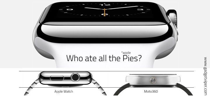
Fair play, maybe it’s not that much thicker than the Moto 360, it still looks bloated. It could be the large rounded edges making it appear wider than it is.
How is it that the Moto 360 should be 4mm longer than the Apple Watch in that comparison photo, yet it’s shorter in your version. Fuzzy math. The Moto 360 is a much bigger watch, overall. The millimeter difference in thickness is negligible.